
Saturday, 15 June 2013


Saturday, 11 May 2013
Exercise - Supermarket shop, conte pastels

Check and log -
I found with the different size objects hard knowing where to start, so I started with what seemed to be closest to the middle of the picture. Once I had drawn the bouillon pot and was happy it was in proportion I could use this to measure the other supermarket objects against it. I think i managed to get the heights fairly close but found it hard to achieve depth and demonstrate distance between the objects. Over all I am happy with the shape and form but i will have to work on how to achieve distance between each object to create a more 3D effect. I also experimented with conte crayon to colour this drawing, this I found interesting to use, it was good for detail but hard to blend the colours together, I used a cotton bud to achieve this in the end.
Friday, 10 May 2013
Exercise - Using charcoal

I enjoyed using charcoal and found it soft to use and produced a good effect quickly. Using the side of the charcoal stick I could achieve straight lines and then using the stick flat to the paper could cover large areas with a textured finish. By applying different amounts of pressure would create a variety of different depth and shading techniques which I have demonstrated in my drawing above.
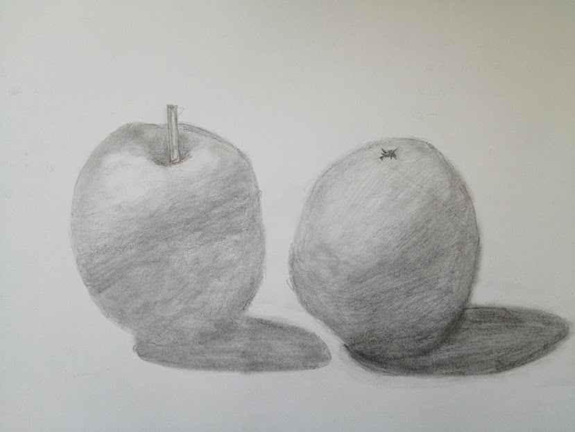
Exercise - Basic shapes and fundamental form
I found demonstrating fundamental form drawing jugs and jar more natural than implementing the books and boxes. I found that it was hard to get the proportions correct and the lines didn't seem true to the boxes and books in front of me. The jars and jugs were for me easier, I started with pencil and continued with ballpoint pen once happy with the shapes. Over all I found these exercises difficult when trying to demonstrate distance between the objects and achieving depth.


Exercise - Mark making
Here I experimented with different grade pencil, oil pastel, thick charcoal, willow charcoal, thick charcoal stick, felt pen, conte crayon and ballpoint pen. I used these to try different techniques of line and mark making. I found the pencil was good for detail and shading, but the charcoal and black pen and conte crayon more dramatic and moody. The charcoal created texture and draws the eye, where as the conte crayon was better for detail and I could create a finer line.


Research Point

-Starry night pen & ink drawing by Van Gogh 1888 - 1889
Thursday, 9 May 2013
Welcome to my Blog!
I am currently studying with the OCA and completing the first year in Drawing 1. I have never blogged before so here goes...
A little about me...
I live in a little sleepy town called Clevedon, with my husband and cat. We recently bought a house which we are slowly renovating. I have a always had a passion for art and dabble with a variety of mediums in drawing and painting. The majority of the time I have enjoyed painted in Acrylic on a variety of surfaces, these I have kindly given to friends and family who are my biggest fans..so they tell me ;O)
So the beginning of this year I decided I would like to further my skills and attempt to complete an Art degree which maybe slightly over ambitious but here I go...
Subscribe to:
Comments (Atom)